Getting Started: Atlas 101
Welcome to the US Covid Atlas! In a quickly changing pandemic landscape, the US Covid Atlas connects case data and community indicators across the United States and helps you visualize current and historical data to better understand the often unequal impact of the pandemic. This Learning Tutorials provide an overview, with step-by-step instructions, on how to use the Atlas and its tools and features. Resources in the US Covid Atlas Learn Toolkit will help you:
- Explore data and choose your variables of interest;
- Learn how to map and visualize US county and state COVID-19 and contextual data;
- Focus on the impacts on communities using various data tools and visualization options;
- Easily export and share Atlas maps and data and customize community reports.
Get started with an orientation to the main mapping application.
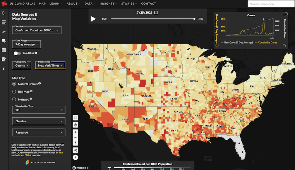
Map Orientation
Start exploring the Atlas by navigating to uscovidatlas.org/map. After a few seconds, the main map will load. If you are returning to the Atlas and new data or features are available, you will see an option on the bottom right side of the map to reload.
After selecting an overlay, you can visualize COVID or community data with the natural breaks binning, box map binning schemas, hotspot analysis, and any other tools that are available within the Atlas.
-
The Main Map is shown at the center of the screen and takes up the majority of the view. A Map Legend can be found at the bottom of the screen, and the Map Control panel allowing you to zoom in, out, and more is at the left side.
-
At the far left side of the screen, you will see the Map Navigation panel. Data Sources & Map Variables is selected as the default, presented as a left sidebar.
-
At the top of the map, you’ll find the Time Slider & Calendar panel, used to select time.
-
At the right side of the screen, you’ll see the Line Chart) floating panel, which you can move. This shows a graph of cases over time, with multiple options for viewing in-depth.
-
Once you click on the map, a scrollable right sidebar appears. This Community Data panel provides more contextual information of the county clicked on within the main map.
-
At the top of the screen, you’ll find the main Site Navigation panel.
Main Map
The thematic map (also known as a “choropleth” map) shown as the default on the Atlas presents county-level data on COVID-19 cases for the country. On the bottom of the map, you will find a Map Legend, which provides a guide to interpret the map colors. See the legend displaying Confirmed Count per 100K Population with the color scale in the example above. Values with 0 or missing data will be shown in light gray. In the example screenshot above, Florida is grayed out because there was no data available for the state for the specific selection made.
At the bottom left of the map, you’ll find your Map Controls:
Select a rectangular area with this control. Data in the Line Chart and Community Data panels will be re-aggregated to show the area average.
This icon re-zooms the map to your current location. Note: Location services will need to be enabled on your device for this functionality to work.
The plus or minus icons will allow you to Zoom in and out of the map.
Use the North compass arrow to reposition your map so that North is facing up on your device screen.
This sharing icon will allow you to share the current view of the map and selections as a URL. The link is automatically copied to your clipboard.
At the top right side of the map, you will find an option to Search By Location. Enter an address, county, city, or any place in the U.S. and hit return to re-zoom the map to your area of interest.
Map Navigation Panel
The Map Navigation panel is a fixed panel on the left sidebar with multiple options that will assist in selecting data, variables, and more customized options.
The default selection is the first icon, Data Sources & Map Variables, where you can select your map variables, date range, data source, and other options. You can turn this panel on or off by clicking this icon.
The next icon opens and closes the Community Data panel, which pops up as a scrollable right sidebar on the screen. It will always be to the right of the main map. If you click a county on the map, you will find additional information on COVID-19, community contextual data, and related health factors for that county in this panel.
You can turn the Line Chart, which shows you an overview of the data over time, feature on or off using this icon. The chart shows up on the right side of your screen as a default, and can be moved as a floating panel.
This Add Custom Data icon opens the Atlas Custom Data Loader. This feature helps you visualize and analyze your data by loading it in the Atlas web interface. Click on this icon to open and close the Data Loader.
Next, the Report Builder icon controls the Atlas Report Builder. With this tool, you can build a custom report to help you and your community understand the context of COVID-19 and social determinants of health.
The Stories icon opens the Atlas Stories data layer, featuring real stories from people about their pandemic experiences, tagged to their counties. You can learn more about that project at stories.uscovidatlas.org.
The Information icon brings you to more information about the latest version of the US Covid Atlas, new features, interface tips, and tutorials where you can learn more about the myriad use cases for the Atlas.
Time Slider & Calendar
The Time Slider & Calendar will allow you to explore the entire timeline of the pandemic. Navigate to the start of the pandemic, select a range of dates to highlight the Delta phase, or just click "play" to watch the pandemic unfold.
To view how data in this county has changed over time, move the Time Slider by dragging your cursor along the white line or pressing the play button, or by clicking on the date and Calendar Icon at the top to select a date.
Explore a certain date, or range of dates.
The play button starts a map animation.
Pause at any time to get a closer view.

Site Navigation Panel
Use the Site Navigation Panel at the top of the screen in order to explore the US Covid Atlas and Atlas Stories websites and learn more about our work.

-
MAP takes you to the main map page, where you can explore and visualize COVID-19 and community contextual data in multiple ways.
-
LEARN has options for viewing this toolkit and tutorials, methods, and FAQs about the Atlas.
-
ABOUT has an overview of the US Covid Atlas, team members, and our Community Advisory Board.
-
DATA has data documentation and a data downloader tool.
-
INSIGHTS has recent academic research and publications, the Atlas Insights blog with quick updates, and other recent data visualization projects.
-
STORIES has more information on Atlas Stories, our oral histories collection project, how to submit a story, story archive, and a link to the Stories feature on the Atlas map.
-
CONTACT has a quick and easy contact form to get in touch with the Atlas directly.